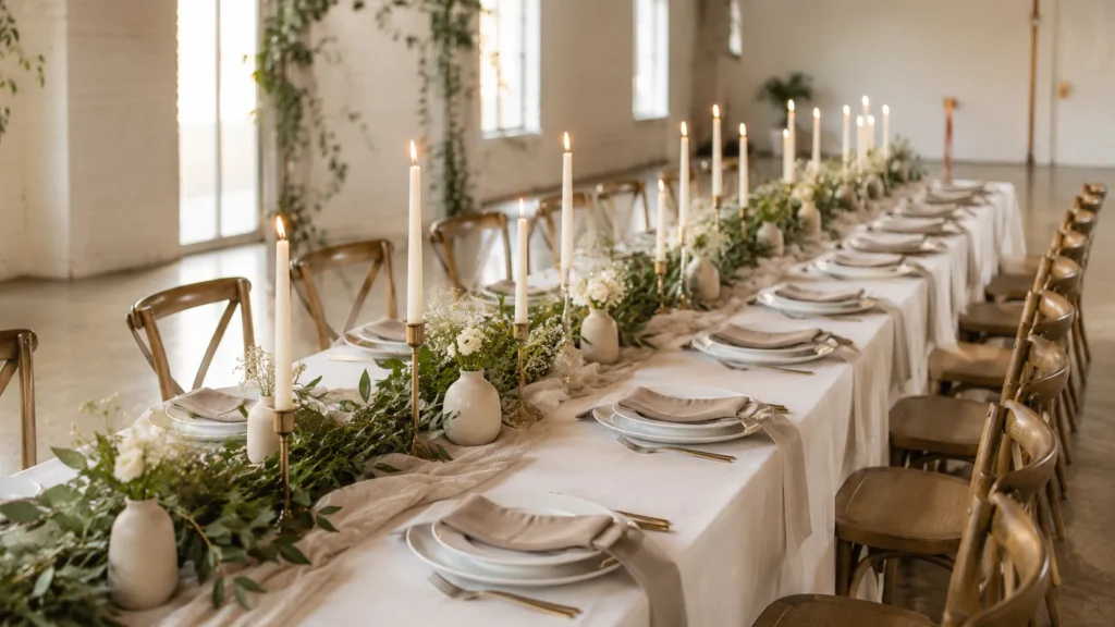
I’ve found that a neutral wedding table can go one of two ways. It can look soft, dreamy, and expensive in that “effortless but clearly planned” way. Or it can look like someone got nervous and bought beige everything. There’s a difference, and it matters.
The tricky part is that neutral wedding decor seems simple at first. Cream, white, tan, taupe, done. Cute. But then the table starts looking flat, and suddenly beige gets bossy. Nobody wants a reception table that whispers, “I gave up at aisle seven.”
Since I live in Orlando, I’ve seen how fast pretty event details can turn pricey. One minute, you’re admiring candlelight and linen napkins. The next, you’re mentally selling patio furniture to fund charger plates. So, yes, I love a beautiful table. However, I love it more when it doesn’t bully the budget.
That’s where neutral wedding table styling gets sneaky, in the best way. You don’t need a thousand flowers or crystal goblets. Instead, you need warmth, layers, contrast, and a few smart choices that look far fancier than they cost. A pretty table should make guests lean in. It should not make your bank account start sweating through its blazer.
And the funniest part? The best neutral tables often come from subtraction, not shopping. Once you see that, the whole table starts making sense.
This is where the good stuff starts to show up, and some of it is shockingly simple.
Some of the links on this page are affiliate links, which means I may earn a small commission if you purchase through them. It never costs you extra. You can always peek at my full disclosure if you’d like the details.
Start With A Neutral Wedding Table That Knows Its Lane
A neutral wedding table needs a point of view. That sounds dramatic for napkins, but here we are. If every item looks almost the same, the table can turn bland fast. However, when each piece has a job, neutral becomes calm instead of boring.
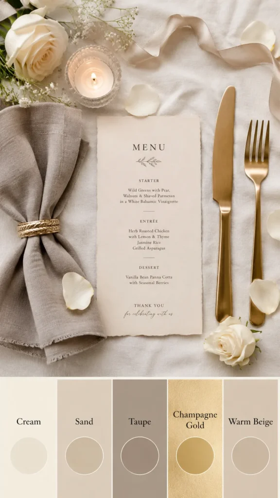
I tend to notice that people treat neutral like it means “no color allowed.” Not quite. A neutral wedding table can include cream, ivory, oatmeal, sand, mushroom, mocha, clay, stone, champagne, and soft gray. See? Beige has cousins. Some of them are rich, moody, and frankly underappreciated.
The real trick is choosing one main neutral, then adding two supporting shades. For example, ivory linens can pair with taupe napkins and warm wood accents. Another option is white plates, champagne candles, and stone-colored runners. That tiny shift gives the eye somewhere to land.
Flat is the enemy. Simple is not.
Also, don’t make every piece “special.” That’s how tables get loud without meaning to. Linens can create softness. Centerpieces can add height. Candles can bring shine. When everything competes, nothing looks expensive.
A budget-friendly neutral wedding table works best when it looks collected, not crammed. Skip the random extras that don’t earn their spot. Those tiny favor boxes, scattered gems, and five different signs can drain money fast. Cute clutter is still clutter, and it charges admission.
Instead, choose details that pull double duty. A pretty napkin can add color and texture. Printed menus can dress the place setting. Even one candle can add height, glow, and shape for very little money. The table starts looking thoughtful, and nobody needs to know the budget behaved itself. Tiny choices can boss a table politely.
Neutral Color Palettes That Don’t Look Washed Out
Neutral color palettes can get very sleepy if everything matches too hard. I said what I said. A wedding table should look soft, not like it got covered in pancake batter. So, the goal is gentle contrast, not one big beige blob.
Here are neutral wedding table palettes that look pretty without getting precious:
- Ivory, champagne, and warm taupe for a soft romantic look
- White, sand, and natural wood for an airy garden look
- Cream, mocha, and antique gold for cozy elegance
- Stone, mushroom, and linen white for a modern organic table
- Bone, clay, and terracotta beige for a warm earthy style
- Soft gray, pearl, and brushed silver for a cooler classic look
- Oatmeal, espresso brown, and ivory for rich fall wedding tables
The surprise is that neutral does not mean light. Sometimes a darker shade makes everything look more expensive. A mocha napkin can make plain white plates look styled. Espresso taper candles can add drama without adding another floral bill. Tiny mood shift, big payoff.
However, pick your metal carefully. Gold warms things up. Silver cools things down. Black adds contrast. Brass gives a vintage edge. Mixing metals can work, but only when it looks planned. Otherwise, it starts giving “borrowed from five closets.”
A neutral wedding table also looks better when the palette matches the room. White walls can handle warmer tones. Dark wood venues often need ivory, not stark white. Outdoor weddings love natural textures because sunlight can make shiny pieces look harsher, too.
So, before buying anything, picture the table in the real space. Not the Pinterest fantasy space. Picture chairs, flooring, lighting, and Aunt Linda’s purse under the table.
The Budget Secret Hiding Under Every Neutral Wedding Table
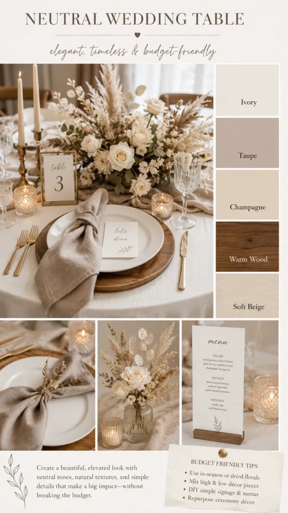
The biggest budget secret is boring, which makes it weirdly powerful. Spend money where guests look first. Save money where they barely glance. A neutral wedding table makes this easier because the whole style depends on editing.
Most guests notice three things right away. Guests notice the centerpiece, the place setting, and the glow. People rarely inspect the edge of the tablecloth. Nobody analyzes the brand of charger plate. Also, nobody writes a Yelp review about napkin rings. At least, I hope not.
That means you can use simple base pieces and make the “top layer” prettier. Plain white plates can look polished with cloth napkins. Budget glassware can look elegant beside taper candles. A basic runner can work when texture carries the table.
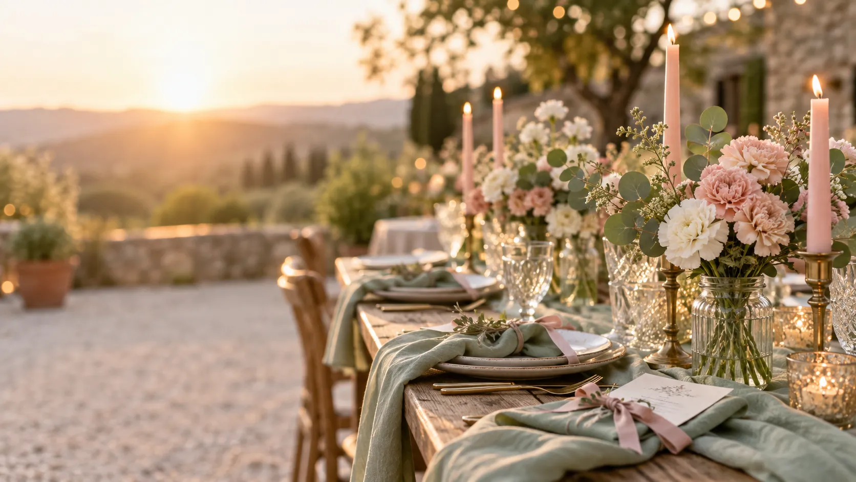
Here’s the tiny twist: one strong detail can make cheaper pieces look intentional. Velvet ribbon around a napkin changes the whole place setting. Dried greenery adds softness without taking over. Creamy menus give the table weight.
Cheap can look cheap when it looks random. Affordable looks chic when it looks repeated.
I’d rather repeat one simple idea across every setting than buy ten different decorations. Repetition makes a neutral wedding table look designed. It also keeps spending in check, which is not boring. That’s freedom with better lighting.
Another smart move is choosing rentals only where they matter. Rent linens if the venue tables look rough. Upgrade chairs if they dominate the room. However, skip fancy forks unless flatware truly matters to you. The fork lobby will survive.
Wedding budgets can get dramatic very fast. So, let the table have a few fancy moments, then let the rest behave beautifully, too.
Texture Makes A Neutral Wedding Table Look Intentional
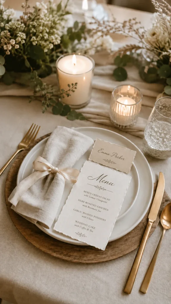
Texture is what saves a neutral wedding table from looking like a plain hotel setup. Color gets all the attention, but texture does the heavy lifting. It adds depth without shouting. That whole table says, “Yes, this was planned,” but in a calm little indoor voice.
The easiest texture wins are usually surprisingly affordable, too, somehow. That seems illegal, but I’ll allow it.
Try mixing a few of these textures:
- Linen napkins with a slightly rumpled, soft finish
- Gauze runners for movement and a light airy look
- Wood chargers or woven placemats for warmth
- Ceramic plates with uneven edges
- Ribbed glassware for subtle sparkle
- Taper candles with matte or glossy finishes
- Dried grasses, seed pods, or soft greenery
- Handmade-looking paper for menus or place cards
Here’s the part people skip. You don’t need all of them. In fact, please don’t invite every texture to the party. Three strong textures can do more than twelve weak ones. One linen napkin, one ceramic plate, and one ribbed glass can be enough.
A neutral wedding table should give the eye little places to stop. Smooth plates need something soft nearby. Matte linens look better with candle shine. Natural wood works well with creamy paper. Contrast keeps the table from going flat.
Also, texture makes inexpensive pieces look more thoughtful. A gauze runner can soften a folding table. Woven chargers can hide plain rental plates. Deckled-edge place cards can make simple settings look custom.
The common assumption is that flowers create all the beauty. Nope. Flowers help, of course. However, texture keeps the table pretty even when the flowers stay simple. That’s a budget win wearing a linen napkin.
Neutral Wedding Table Centerpieces That Don’t Eat The Budget
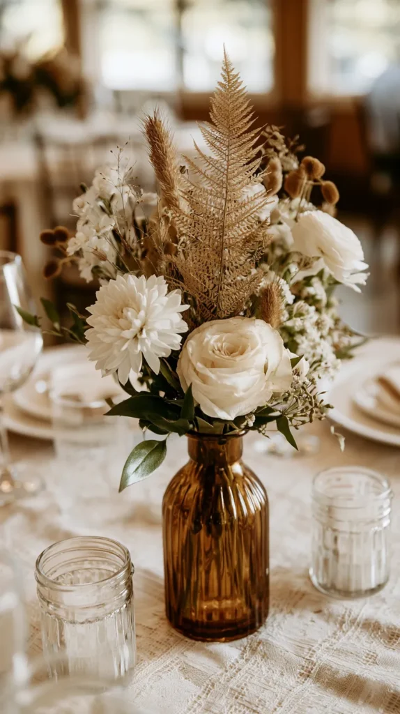
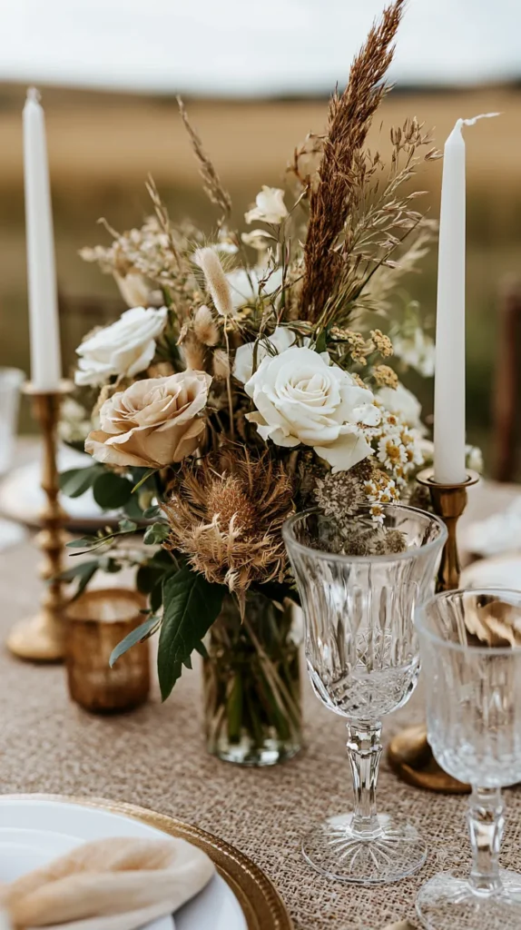
A neutral wedding table centerpiece does not need to look like it entered a floral pageant. I love flowers, but the bill can get rude. Instead, think in layers of height, glow, and texture. That combo gives the table charm without making your wallet hiss.
A few budget-friendly centerpiece ideas can look beautiful when repeated:
- Bud vases with one or two stems each
- Taper candles in mixed heights
- Pillar candles grouped on small trays
- Dried baby’s breath in creamy ceramic vases
- Neutral pampas grass used sparingly
- Small bowls with pears, figs, or artichokes
- Low greenery runners with scattered candles
- Mini potted herbs wrapped in linen or kraft paper
The key word is repeated. One bud vase can look lonely. Six matching bud vases across a long table look charming. One candle looks like a power outage. Several candle heights look romantic.
Still, watch the table width. Guests need room for plates, drinks, elbows, and that tiny bread plate nobody understands. A centerpiece should add beauty, not block conversation. Tall arrangements can work, but they need space underneath. Low centerpieces work better for tight tables.
For a neutral wedding table, I’d lean into cream flowers, beige dried stems, and soft greenery. Then, I’d add warm candles instead of more blooms. Candlelight stretches a budget beautifully. It also makes simple textures look richer, which seems like cheating in the best way.
Another tiny trick is grouping decor on a base. A tray, runner, or wood board makes smaller pieces look like one styled moment. Without that base, pieces can look scattered.
The centerpiece doesn’t need to be huge. It needs to look intentional from every single seat.
The Tiny Details That Make Guests Notice
Tiny details can make a neutral wedding table look expensive, but only when they’re useful. This is where I get picky. Clutter should not pretend to be charm. I want pieces that help the table look finished in real life.
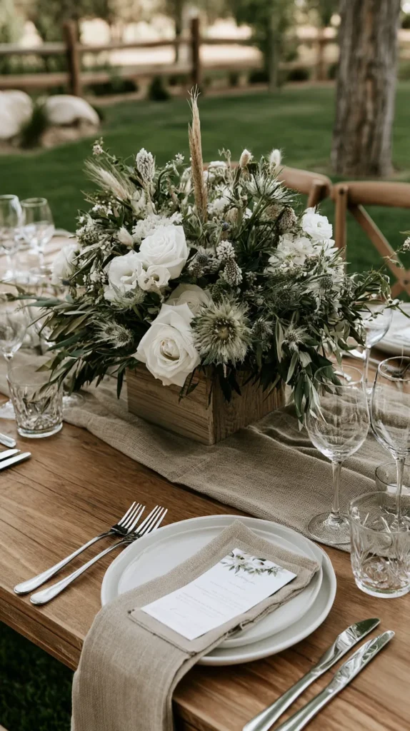
Place cards are a great example. They can guide guests and add a styled layer. A simple cream card with tan ink looks lovely. Add torn edges, wax seals, or ribbon only if they match the vibe. Otherwise, the table starts collecting craft-store trophies.
Menus can also do a lot. Even a simple menu makes each seat look more complete. It gives height to the plate stack and brings in another neutral tone. Plus, guests love knowing what they’re eating. Mystery chicken has caused enough wedding stress.
Napkins deserve more attention than they get. A folded cloth napkin can change the whole place setting. You can knot it, drape it, or place it under the plate. Each choice creates a different mood. None of them require a diamond-encrusted napkin ring, which is merciful.
Here’s the quiet truth. Guests notice care more than cost. They notice when the table looks comfortable. People spot colors that work together. Candlelight can make the whole setting warmer.
However, they don’t need a souvenir at every seat. Budget-friendly wedding decor often works better when it avoids tiny throwaway extras. Instead, put money into pieces that show in photos and help the room.
A neutral wedding table looks best when the details support the whole look. Nothing should scream for attention. The magic sits in the mix, like linen, paper, glass, candlelight, and one perfect little ribbon.
Tiny, yes. Random, no.
Neutral Wedding Table FAQs For Budget Brides
Wedding tables bring out questions fast. That makes sense because there are so many tiny choices. A neutral wedding table looks simple, but simple still has opinions. Strong ones.
Here are the budget-friendly questions I’d ask before buying anything:
- What colors work best? Cream, ivory, taupe, beige, sand, mocha, stone, champagne, and soft gray all work well. However, the best mix depends on your venue.
- How do I keep neutral wedding decor from looking boring? Add contrast through texture, height, and light. Use linen, wood, glass, ceramic, paper, and candles together.
- Can I use white and beige together? Yes, but add a bridge color. Champagne, warm taupe, or natural wood can connect white and beige.
- What is the cheapest table styling trick? Start with simple linens, then add candles, cloth napkins, and printed menus. Those details show up well in photos.
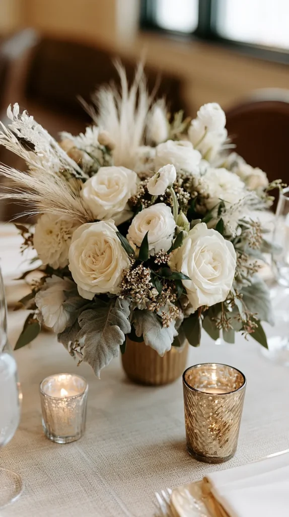
- Do centerpieces need flowers? No, and that is delightful news. Candles, greenery, dried stems, fruit, and pretty vessels can work beautifully.
- Should I use charger plates? Use them if they fit the budget and table space. Skip them if they crowd the setting.
The common answer is balance, which sounds vague until the table starts coming together. Add warmth and texture. Then remove anything that starts acting too important. That last part matters more than people think. Truly, that tiny edit saves money and sanity.
Also, don’t let “budget-friendly” trick you into buying more cheap pieces. More is not always better. Sometimes it just means more packing tape, more boxes, and more regret. A neutral wedding table usually looks richer when it has fewer, better choices. That is the glamorous secret nobody prints on programs.
The Cozy Glow Trick That Changes Everything
Lighting can change a neutral wedding table faster than any centerpiece. This is where things get unfair. You can spend hours choosing beige napkins, then bad lighting walks in and ruins everyone’s mood. Rude, but true.
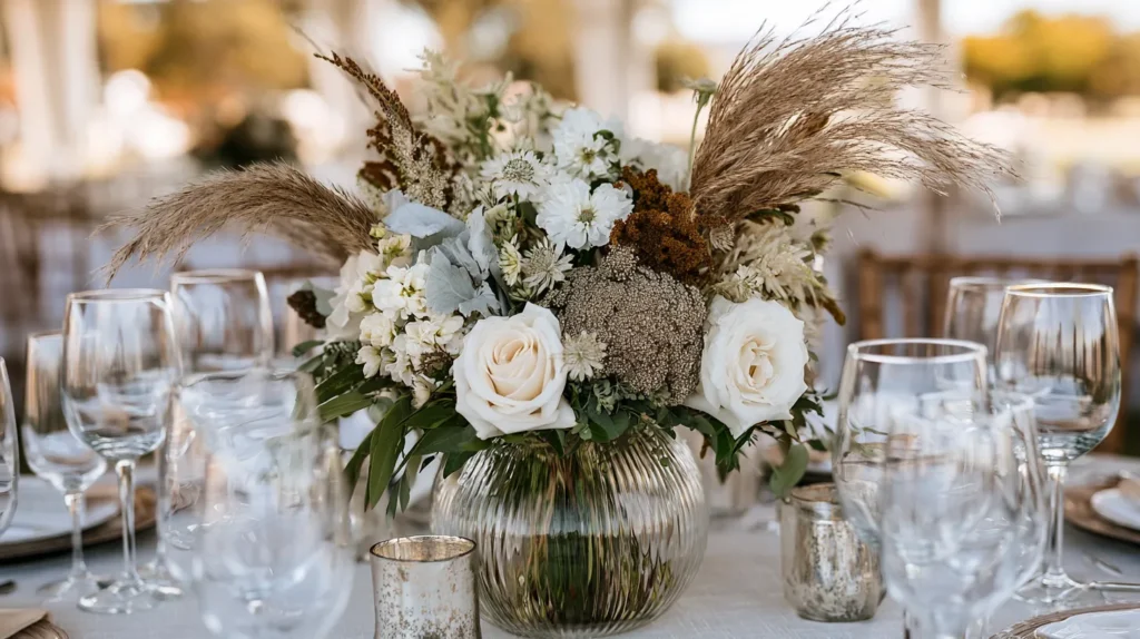
Soft glow makes neutral colors look richer. Candlelight warms ivory, taupe, champagne, and wood. It also hides tiny flaws, which I support fully. Nobody needs harsh overhead lights exposing every wrinkle in the runner.
For budget weddings, candles are one of the best visual buys. Tapers add height. Pillars add weight. Votives add sparkle. Together, they create movement across the table without needing more flowers. However, always check venue rules first. Some places only allow flameless candles, and that’s fine. Good flameless candles have come a long way.
The trick is mixing heights without making the table look crowded. Place taller tapers between lower items. Add votives near place settings. Use pillars where the table needs weight. A neutral wedding table looks layered when light appears in more than one spot.
Also, keep the candle color in the palette. White candles look crisp. Ivory candles look softer. Taupe or mocha candles add drama. Black candles can work in modern spaces, but use them carefully. They change the whole mood quickly.
Here’s the reframe. Lighting does more than create atmosphere. It works as decor. Good glow fills space, adds shine, and makes simple pieces look more expensive. That means you can spend less on “stuff” and still get a table that glows in photos.
Give me candlelight and good linens over a crowded table any day. The table will look calmer. Photos will look warmer. And the budget gets to keep its shoes on.
The Pretty Table Math I’d Bet On
I always think a beautiful table should have a little breathing room. Not empty, and not sparse. Just enough space for the eye to move. A neutral wedding table works best when it lets each detail earn attention.
Maybe that’s why I like budget-friendly design so much. It forces smarter choices. You can’t buy every pretty thing and hope the table behaves. Pick the pieces that matter most instead. Weirdly, that often creates a better result.
Living in Orlando has made me very aware of event sparkle. There’s always another venue, another floral wall, another gorgeous setup. However, I still think the prettiest wedding tables often come down to restraint. A linen napkin. Warm candlelight. Soft neutral color. One tiny detail that looks personal without draining the budget. That little edit can save money and decision fatigue.
Pinterest can turn wedding decor into a contest nobody entered willingly. Still, I think it helps when you treat ideas like a menu, not a command. Take the parts that fit. Skip the parts that get bossy. Let your table look like your day, not someone else’s sponsored dreamscape.
A neutral wedding table does not need to prove anything. It can be warm, simple, romantic, and clever with money. That combination has range. It photographs well, welcomes guests, and doesn’t require a second mortgage for beige napkins.
Pretty counts. Practical counts, too. When they sit at the same table, that’s the whole little wink.