Let’s talk about the moment you type wedding color ideas into Pinterest and tumble down a rabbit hole. Suddenly you’re staring at four hundred pins of dusty blue, sage, and blush. Every single one looks perfect, which is exactly the problem. (Same, by the way.) Somewhere in there, your budget starts to sweat.
Here’s the thing I’ve noticed about color. It’s the one wedding decision that costs almost nothing and changes everything you see. A good palette shows up in your flowers, your napkins, your dresses, and every photo you’ll ever frame.
I’ve found that people overthink this part. They chase trends, then panic when the trend changes. Instead, a calm, simple palette never goes out of style.
I live in Orlando, where outdoor weddings are practically a hobby, so I’ve got opinions about sunshine. Bold light can wash out pale colors fast. Still, a smart palette can handle all of it without a fancy price tag.
So this isn’t a list of trends you’ll regret in three years. It’s a friendly chat about colors that look expensive and cost less. Spending less and smiling more sounds like a fair trade to me. I’ll share seasons, flowers, bridesmaids, and a few sneaky spots where a little color goes a long way.
And yes, there’s one sneaky mistake that quietly drains wedding budgets. I’m saving it for the end, because it’s the one nobody warns you about. (Bring snacks. We’re getting comfy.) Trust me, you’ll want to stick around for that.
Some of the links on this page are affiliate links, which means I may earn a small commission if you purchase through them. It never costs you extra. You can always peek at my full disclosure if you’d like the details.
Why Wedding Color Ideas Are the Cheapest Upgrade
Most people assume a pretty wedding needs a giant budget. I’ve found that this idea is mostly wrong. A cohesive color scheme makes ordinary things look planned, and planned always looks pricier.
Here’s my hot take: matching beats expensive. Picture a gorgeous room with six random colors fighting for attention. Now picture a simple room in two shades that repeat everywhere. Your eye relaxes in the second one, and guests call it “so pretty” without knowing why.
That’s the trick behind every wedding color ideas list worth reading. Repetition tells the brain that someone thought this through. Guests never know what you paid, but they always notice when colors fit together. (Yes, even if that someone bought napkins at midnight.)
Here’s where it gets interesting, though. Color also shapes how much you’ll spend on everything else. A bold palette needs fewer extras because the shade does the heavy lifting. Fewer extras means fewer receipts, and fewer receipts means less stress!
Think about a plain white tablecloth next to a deep green runner. Same tablecloth, totally different room. One cheap swap changed the whole mood.
I tend to notice that couples overspend when they skip this step. They buy a little of everything and hope it all works together. It rarely does, and the credit card remembers.
A palette also works like a shopping filter. Every cute item gets one question: does it match? If the answer is no, you keep your money and skip the guilt.
So pick your colors before you request a single vendor quote. Everything else gets easier once you lock in that choice. Stick around, because the one thing that should sway your palette more than any trend is coming up.
Let Your Venue Pick the Palette
Your venue already has a color opinion, and it’s louder than yours. Brick walls, wood beams, ballroom carpet, and a lakeside view all come with built-in shades. I’ve found that fighting those shades costs money, while working with them saves it.
Here’s the reframe: a venue isn’t a blank canvas. It’s a color you’ve already paid for. Choose a palette that flatters it, and you’ll skip a lot of decor. Before falling for any wedding color ideas, walk the space and look for these clues:
- Floors and carpet: Warm wood loves cream, gold, and terracotta, while gray floors love blush and navy.
- Wall color: A white wall lets almost any palette shine, but a tan wall can dull pale pinks.
- Natural light: Sunny rooms handle soft colors, and dim rooms need richer ones.
- Outdoor views: Green lawns and blue water already act as a free backdrop.
- Permanent decor: Chandeliers, drapes, and stage curtains stay put, so plan around them.
(Yes, I’m telling you to plan around the curtains. Nobody wins a fight with drapes.)
Then take your phone and snap photos in the room around the time of day you’ll marry. Light changes everything. Golden hour flatters almost anything, but ballroom lighting rarely does. A color that looks lovely at noon can turn muddy at dusk.
Also, ask what your venue already includes. Some venues supply linens, chairs, and centerpieces in set colors. If those items are free, build your palette around them and save your budget for other things.
Here’s a small warning, though. Don’t trust the venue’s website photos alone. Pros shot them with perfect lighting, and your guests won’t see that version. Trust your own pictures instead, and you’ll skip a nasty surprise later.
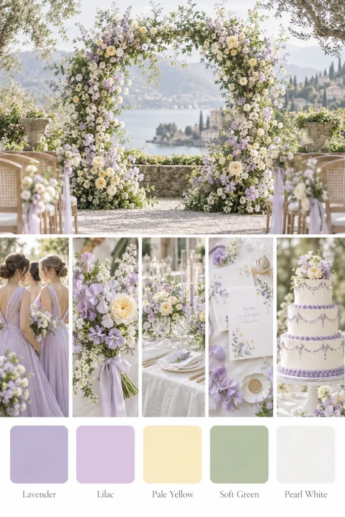
The Two-Color Rule Plus One Neutral
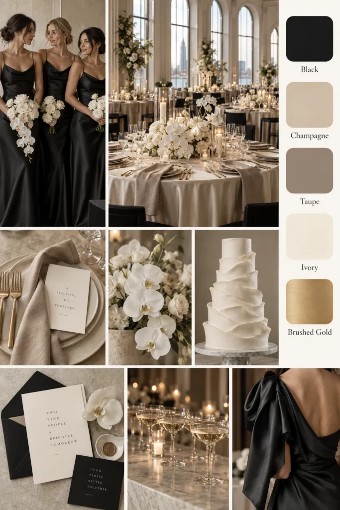
Here’s the rule I keep coming back to: pick two main colors and one neutral. That’s it. Three total, and your whole wedding suddenly looks like it has a stylist.
Why does it work? Two colors give you contrast, and a neutral gives your eyes a place to rest. Think navy and blush with ivory, or forest green and gold with cream. Neither combo takes much effort, and both look great in photos. Two shades also look bold without looking busy.
Now, the reframe. People think more colors mean more creativity. I’ve found that the opposite tends to happen.
Limits make you sharper, and a small palette forces smart choices. (I know, I know. Rules are annoying. Bear with me.)
Here’s where budget sneaks in. When you use the same two colors everywhere, you can buy in bulk. Ribbon, candles, napkins, and paper goods all cost less in larger amounts. You’ll also swap items between the ceremony and reception without anyone noticing. That’s real savings, and it adds up fast.
Ever notice how a little bouquet looks stunning next to a matching runner? That’s repetition doing its job. It also means your wedding color ideas stretch across every part of the day.
But what about a third accent color? Sure, you can add one tiny pop, like mustard or coral. Coral against navy, for instance, looks fantastic without costing extra. Just keep it to about ten percent of what people see, because otherwise the palette starts to shout.
One more thing before we move on. The neutral matters more than you’d guess, and most couples pick the wrong one. Stay with me, because I’ll explain that in a minute.
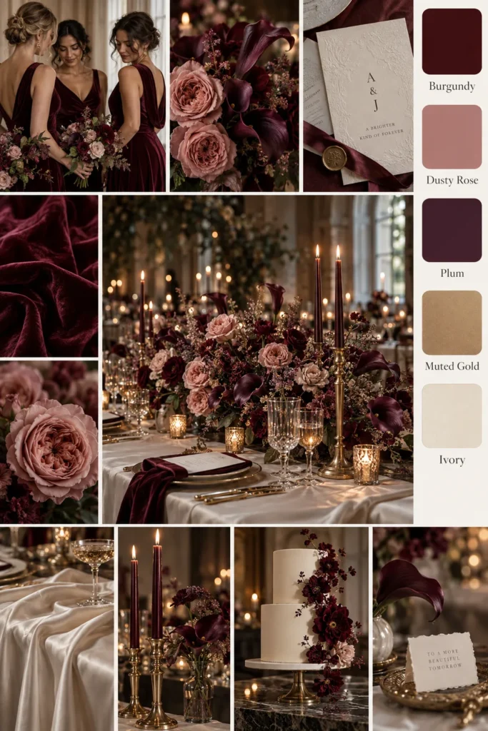
Wedding Color Ideas by Season That Save Money
Seasons matter more than most people realize. When your colors match what’s in bloom, your florist can use fresh, local stems. That often costs less than shipping in a flower that’s out of season. I’ve found that this one choice can stretch a floral budget nicely. Here are my favorite budget-friendly wedding color ideas for each season:
- Spring: Soft peach, lavender, and butter yellow match tulips, ranunculus, and other early bloomers.
- Summer: Coral, sunny yellow, and sky blue suit bright days and lush greenery.
- Fall: Burnt orange, deep burgundy, and mustard look rich beside warm candlelight.
- Winter: Emerald, navy, and silver look cozy and polished (evergreen branches are cheap, too!).
Each palette also comes with a built-in decor bonus. Fall brings pumpkins and leaves, spring brings blossoming branches, and winter brings pine. Nature hands you props for almost nothing, and they match your colors automatically.
Now, here’s the twist. Florida seasons blur together, so I tend to choose colors by the heat instead. If you’re marrying somewhere hot, deeper shades often hold up better than pale ones. Pastels can look faded in strong midday sun.
Also, your date and your colors don’t have to match the calendar. A pink winter wedding can be lovely! Just ask your florist which stems are cheap that month, then build outward from there. You can even borrow one accent from the next season for a fresh twist.
And here’s a bonus reframe. Many people think off-season dates are the only way to save. But an off-peak date or a Friday wedding can trim costs too. Venues often charge less on weekdays, so it’s worth asking. Best of all, your colors stay flexible either way.

Wedding Color Ideas That Match Cheap Flowers
Flowers can swallow a budget in one afternoon. That’s why I like to build a palette around affordable blooms instead of chasing pricey ones. (Backwards, I know. Stay with me.) Most couples pick colors first and hunt for matching flowers second, which gets expensive fast.
Some blooms cost less than others. Carnations, alstroemeria, chrysanthemums, sunflowers, and baby’s breath tend to be kind to a budget. Greenery like eucalyptus fills space beautifully for very little. Meanwhile, peonies and garden roses usually cost more, so I treat them like jewelry. Ask your florist which stems are cheapest that week, because prices shift.
Here’s the reframe I love. Cheap flowers only look cheap when someone styles them badly. Cluster one type in a single color, and the whole arrangement looks lush. White carnations in a jar look fancy. Six random kinds together look like a gas station bucket.
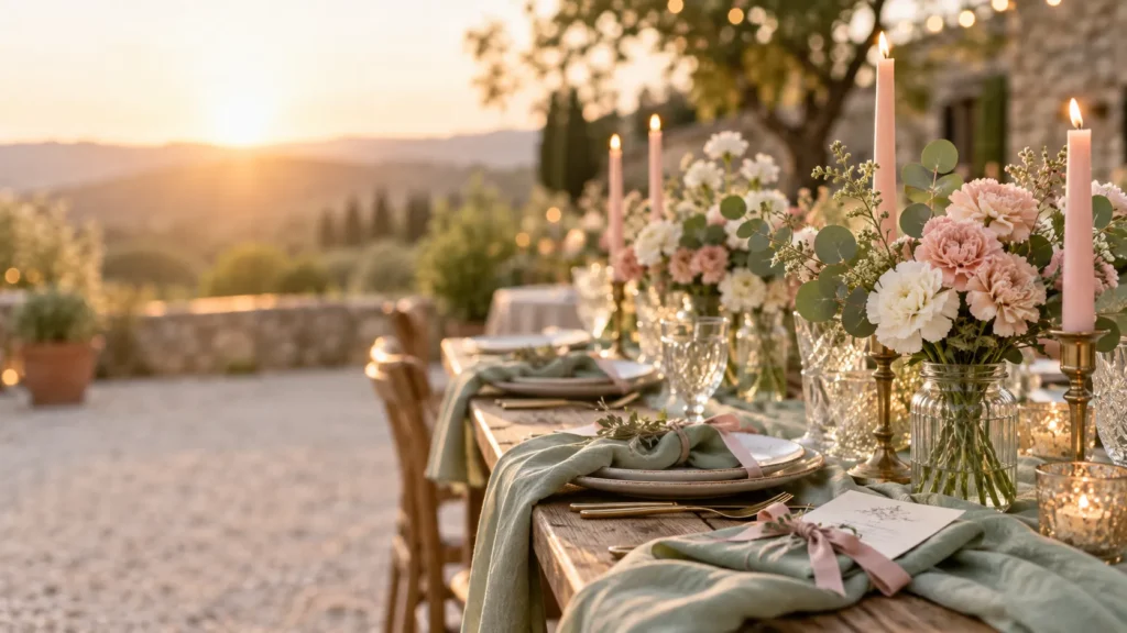
For wedding color ideas that suit budget blooms, I’d start with three pairings. White and green give you a classic, airy look. Sunflowers and sky blue bring something sunny and playful. Then, for a romantic mood, blush carnations and sage eucalyptus work beautifully together.
I’ve found that plenty of couples also buy grocery-store bunches and arrange them the day before. It’s a smart move when your palette stays simple. Wrap the stems in ribbon that matches your palette, and the bunch looks custom. Bonus points if you thrift the jars. Trust me on this one: two or three colors of flowers are plenty.
Here’s a little curiosity for you. Greenery can count as a color in your palette. That means your budget flowers can stay white, and the leaves carry the rest. Plus, it’s cheeky, it’s thrifty, and it photographs beautifully.
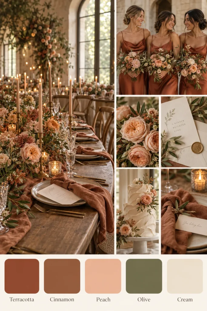
Sneaky Places to Add Color for Less
Some of the cheapest color upgrades never show up on a wedding checklist. I tend to notice that people spend big on large items and forget the small ones. Small things repeat across a room, though, so they carry your whole palette. Here’s my ranking of the best color for the money:
- Napkins: Every guest touches one, so colored napkins repeat your palette at each seat.
- Candles: Tapers in a bold shade add color and glow for a few dollars.
- Ribbon: It ties onto menus, bouquets, and chairs without any fuss.
- Thrifted vases: Mismatched glass looks like a set after a coat of spray paint.
- Paper goods: Printing at home or at an office store costs far less than custom stationery.
None of these need special skills, and most take less than an hour. Thrift stores are gold for this project. Glass jars, brass candlesticks, and old frames often turn up cheap, and one shade of paint unites them. Even better, wedding color ideas that use thrifted finds look personal instead of packaged.
Here’s my slightly rebellious opinion. Everyone says to splurge on flowers, but I’d argue the tiny repeated stuff does more. A hundred small touches of navy beat one giant arrangement. You’ll see it in photos, too, because color shows up in every corner of the frame.
Meanwhile, keep the number of colors low as you shop. It’s tempting to grab a cute item in a random shade, and that’s how palettes fall apart. If it doesn’t match your two colors or your neutral, leave it on the shelf. A tight palette saves more than any coupon code ever will. Your future self will thank you (and so will your wallet).
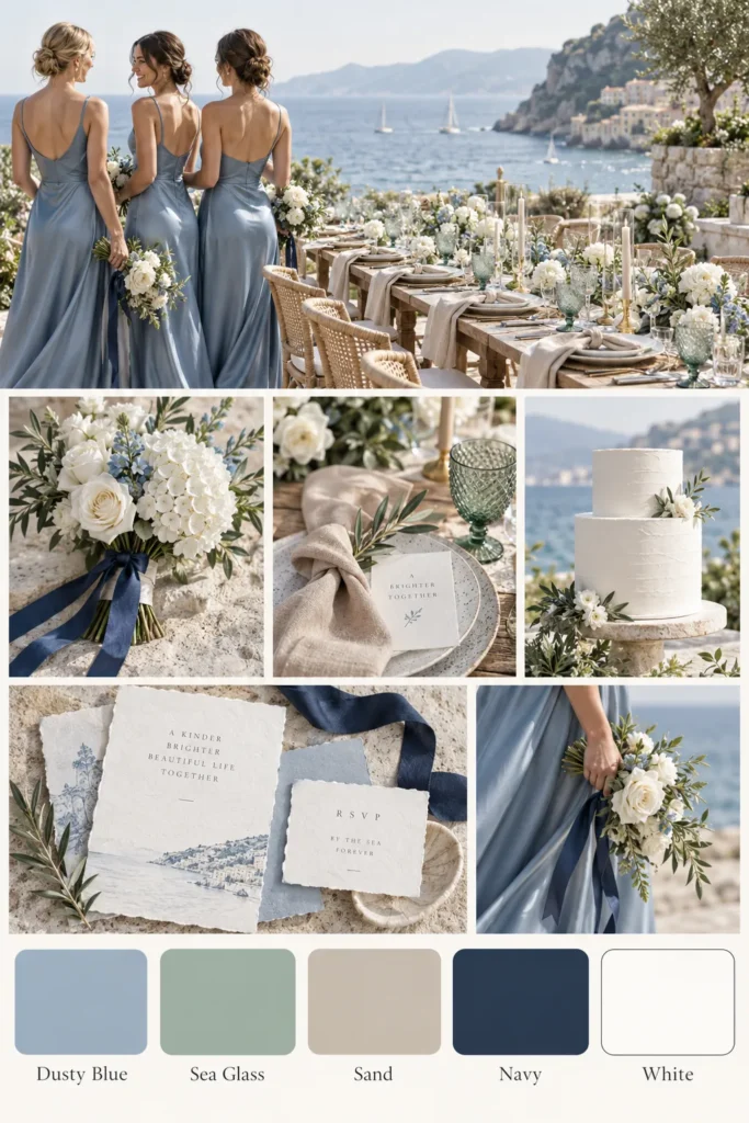
Wedding Color Ideas for the Bridal Party
The bridal party is where color can go from charming to costly in one group text. Bridesmaid dresses often cost the most per person, and your friends pay for them. That’s why I lean toward flexible palettes here. Smart wedding color ideas for your crew protect friendships as well as budgets.
Here’s the reframe: matching doesn’t mean identical. Ask everyone to wear one color family, like sage, and let each person pick a style. Different necklines and fabrics in the same shade look intentional. They also let your friends choose something they’ll wear again. (Revolutionary, I know.)
I tend to notice that loose coordination photographs warmer than a stiff, all-the-same look. It reads relaxed, modern, and a little more real. Besides, nobody has to squeeze into a style that doesn’t suit them.
For groomsmen, keep suits in a neutral like gray or navy. Then bring in your accent through ties, pocket squares, or suspenders, which cost far less to swap. If they already own a dark suit, you’ve skipped a rental fee, so ask around first.
Accessories are another easy win. Ask bridesmaids to wear neutral shoes they already own, like nude or gold. Skip the dyed-to-match pairs, because they cost extra and friends rarely wear them again. Even so, a ribbon in your accent shade on each bouquet ties everything together.
And the little ones? Flower girls can wear white or cream with a ribbon sash in your accent color. Best of all, it looks sweet and costs very little.
Finally, talk to your bridesmaids early. A friendly, honest text about budget goes a long way. Most people appreciate the honesty, and nobody wants to whisper about a pricey dress in the group chat. Say it with me: your friends aren’t props.
How to Test Your Palette Before You Commit
Now for the sneaky mistake I promised earlier. Couples order decor in bulk from a screen, and the colors show up different. Screens fib. (Flatteringly, sometimes, but they still fib.) Returns are annoying, and reorders cost shipping, so the savings vanish.
Remember the neutral I mentioned? This is where it matters. Pure white can look icy next to an ivory dress. Ivory can look dingy next to bright white napkins. I’d test your neutral first, before anything else.
Many shops sell a single napkin or a small ribbon spool. Buy one before you buy fifty. It’s a tiny cost that protects a big order. Here’s a simple way to test wedding color ideas without spending much:
- Order tiny swatches or fabric samples, then look at them in your venue’s real light.
- Set your dress fabric next to your napkin sample and your ribbon.
- Snap a phone photo, then check it again in a black-and-white filter.
- Ask two honest friends, “Do these clash?”
- Sleep on it for a week before you buy in bulk.
The black-and-white trick is my favorite. It shows whether your colors have enough contrast. If everything turns into one gray blob, add a lighter or darker shade. Nothing here costs much, and all of it beats returning a box of wrong-colored napkins. Also, test at different times of day, since morning light looks cooler than evening light.
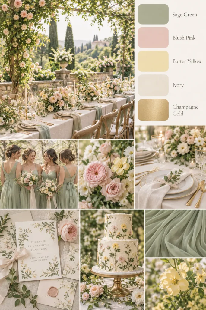
Then trust your own eyes over any board. Pinterest is gorgeous, but someone curated and edited every pin. Those photos come with pro lighting and a big budget. You might catch yourself muttering, “Wait, is that teal or green?” That’s a good sign, because it means your samples are doing their job.
FAQs
How many colors should a wedding palette have? I recommend two main colors and one neutral. You can add one small accent if you love it. But more than that tends to look busy and cost more.
Which colors cost the least? Wedding color ideas that match in-season flowers and easy-to-find supplies usually win. Think white, cream, greenery, and one soft shade. Flowers, not hues, drive most of the price, so choose your blooms wisely.
Can I mix gold and silver? Yes, if you let one metal lead. Make gold the star and use silver as a tiny accent. That keeps the look intentional instead of messy.
How early should I choose my colors? Choose them before you book any decor. Colors guide flowers, attire, and stationery, so picking first prevents expensive do-overs later.
Are dark colors more expensive than pastels? Not really. Navy, forest green, and burgundy often cost the same as pastels. Dark shades can also hide small wrinkles and smudges on napkins and runners.
Do I need a palette for a minimalist wedding? Yes, even a simple wedding benefits from a plan. One color plus one neutral counts as a full palette. Plus, it keeps your shopping easy and your photos consistent.
Can I use my favorite color if it isn’t trendy? Absolutely! Trends fade, but a shade you love stays fun to look at. Pair it with a neutral, and it reads classic instead of dated.

The Pretty Part Doesn’t Have to Cost a Fortune
Here’s what I keep coming back to. Weddings get expensive when we try to buy a mood, and color lets us create one for pennies. I’ve found that a tiny palette, used with confidence, beats a giant budget almost every time.
I tend to notice that Pinterest rooms that look like a million bucks often cost far less. (Shocking, I know.) Those rooms nearly always repeat two colors and one neutral. That’s the whole secret, and it isn’t even a secret. Restraint is the difference between a wedding that looks curated and one that looks crowded.
Here in Orlando, weddings happen under sunshine and string lights all year long. That light is free, and it makes every palette look a little happier. Still, color has to earn its keep out there. So I’d take your favorite wedding color ideas and trim them in half. Then trim them in half again, if you dare.
Choosing colors is the fun part of planning, so let it stay fun. You don’t need a spreadsheet or a stylist. A shortlist, a few samples, and one honest friend will do the job. Budget weddings aren’t smaller dreams, after all. They’re smarter ones.
Pick shades you’d happily wear, frame, and photograph. Your guests won’t count the colors you skipped. Instead, they’ll remember how beautifully everything came together, and they’ll remember you looked happy.
Because at the end of the day, nobody has ever asked what the napkins cost.