A wedding welcome sign feels like such a tiny detail until you picture guests walking in. Then suddenly, it becomes the first little “hello” of the whole day. No pressure, right? It’s basically the front door, the outfit, and the polite handshake of your wedding, all in sign form.
I’ve found that budget wedding details can get weirdly dramatic. One minute, you’re browsing cute ideas. Next, you’re staring at a custom acrylic sign that costs more than your first grocery run as a married couple. Rude behavior, in my opinion.
Living in Orlando, I tend to notice how weddings here juggle heat, shine, flowers, lawns, patios, and “please do not melt” energy. So, a sign has to look good, stand up, and not require a small construction crew.
The good news? A lovely wedding welcome sign does not need to be fancy in the scary-price way. It needs to look clear, warm, and tied to the day. That’s the part people notice first.
And yes, we are getting into colors, wording, stands, materials, and those sneaky questions brides ask at midnight. Because the sign may look simple, but the choices behind it? A whole tiny circus. Let’s make that circus behave.
Some of the links on this page are affiliate links, which means I may earn a small commission if you purchase through them. It never costs you extra. You can always peek at my full disclosure if you’d like the details.
Wedding Welcome Sign Ideas That Look Expensive
A wedding welcome sign looks expensive when it looks intentional, not when it costs a fortune. That’s my little soapbox, and I’m standing on it in cute shoes. Guests do not know your sign came from a discount frame, foam board, or a Canva template. They know it looks pretty when they arrive.
The trick sits in the mix. Choose one strong idea, then let everything else support it. When every detail screams for attention, the sign starts looking busy. Busy is not festive. Busy is a group text with too many opinions.
Here are budget-friendly wedding welcome sign ideas that still look polished:
- A framed printed sign with soft florals around one corner
- A mirror sign with white vinyl lettering and a simple stand
- A wood sign with painted names and wedding date
- A foam board sign in a thrifted gold frame
- An acrylic-style sign using clear plastic instead of pricey acrylic
- A black and white sign with one dramatic bow
- A garden-style sign tucked near flowers or greenery
- A neutral linen backdrop with a printed welcome panel
Now, here is the tiny twist. The “expensive” part usually comes from restraint. A wedding welcome sign with two fonts often looks better than one with seven. A simple frame can beat glitter, rhinestones, and three competing borders.
I’d rather see one clean sign with strong spacing than a sign trying to host its own parade. Keep the names clear. Let the date breathe. Then add one detail that makes it feel like yours.
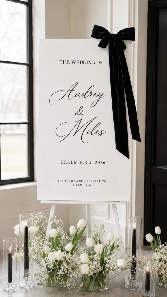
The Tiny First Impression Guests Remember
Guests notice the welcome area before they notice most other decor. That sounds unfair, but weddings love drama. The ceremony flowers might be gorgeous, yet guests first see parking, path, weather, shoes, and signage. Glamorous? Not always. Useful? Very.
A good sign helps guests relax right away. Once they see it, they know they found the right place. The vibe becomes clear before anyone says a word. Even better, guests can stop squinting at every doorway like wedding detectives on a very floral case.
That matters more than people think.
I tend to notice that the best wedding welcome sign does not shout. It greets. It says, “You’re here, come in, we’re happy.” That warmth does a lot. It sets the mood before anyone hears music or sees the aisle.
Here’s the reframe. The sign does not need to carry the whole wedding look. It just needs to open the door. That takes pressure off, which I support deeply.
A welcome sign can look romantic, modern, rustic, beachy, garden-like, or sleek. However, it should still match the rest of the day. A glam black-tie wedding with a casual chalkboard sign can look mismatched. A backyard wedding with a glossy gold mirror can look fabulous, though. Context decides.
Before buying anything, picture the first ten seconds. Guests walk in, slow down, read the sign, and smile because they know they’re in the right place. Then they move forward without that awkward little “Are we supposed to be here?” shuffle.
That is the job, and it does not need to be dramatic. The sign does not need perfection, shock value, or a tiny plea that says, “Please admire my font choices for seven minutes.” It just needs to offer a warm, pretty, confident hello before guests step into the day.
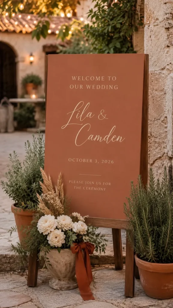
What To Put On A Wedding Welcome Sign
A wedding welcome sign should give guests the right information without turning into a tiny wedding website. This is where people can get carried away. I understand the urge. Weddings contain many moving parts, and signs feel helpful. Still, the welcome sign should stay clean.
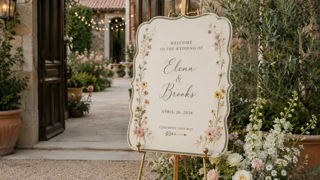
Start with the basics. Your names matter most. After that, the date often comes next. If your ceremony and reception happen in the same space, you may not need more. If guests need direction, add a short line below.
Here are easy wording options for your wedding welcome sign:
- Welcome to the wedding of Ava and Miles
- Welcome to our beginning
- The wedding of Emma and James
- We’re so glad you’re here
- Welcome, family and friends
- Please join us as we say I do
- Today two families become one
- Find your seat, not a side
- Ceremony this way
- Reception to follow
The best wording depends on your setup. A formal venue can handle “Welcome to the wedding of.” A backyard wedding may suit “We’re so glad you’re here.” Both work. Neither needs to sound like a royal decree, unless that is the plan.
Include a hashtag only if guests will truly use it. An unplugged ceremony note also works, but only when you want fewer phones during the vows. If guests might wander toward the wrong lawn, room, or patio, add one short direction line before confusion gets cute.
Less can look more elegant. That’s annoying but true.
A clear sign gives guests confidence. A crowded sign gives them homework. And nobody came dressed in heels to read homework.
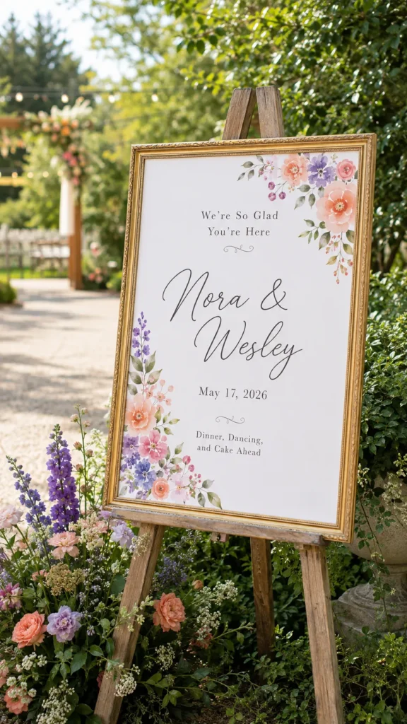
Wedding Welcome Sign Colors That Pull Everything Together
A wedding welcome sign can make your colors look more planned than they are. This thrills me because budget weddings deserve little tricks. Color creates the connection guests notice, even when they cannot name it.
You do not need to match every single shade. In fact, that can look forced. Instead, choose one main color from your wedding and one soft support color. Then add a neutral. That keeps the sign calm and pulled together.
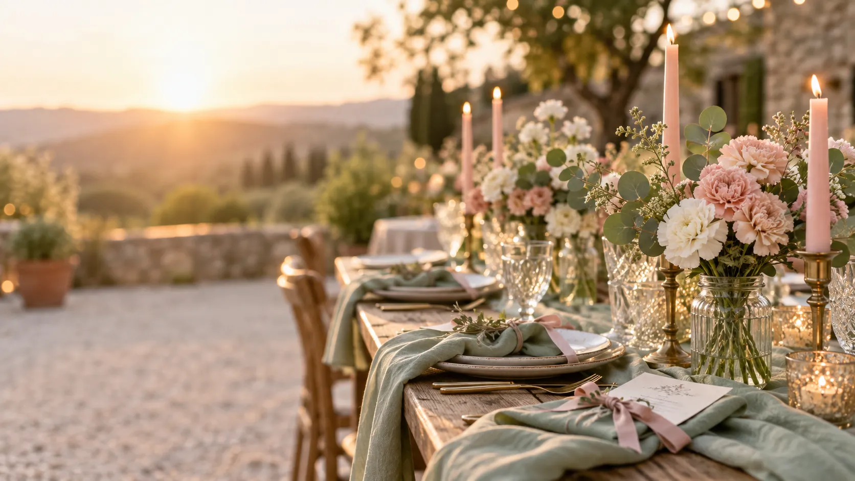
For example, dusty blue with ivory and warm wood looks soft. Black, white, and gold looks crisp. Sage, cream, and pale blush looks gentle without going sleepy. Terracotta, beige, and white feels warm and modern. Navy, white, and greenery feels classic but not stiff.
The sign should not fight the flowers. It should nod at them from across the room. Cute, subtle, and a little smug.
If your wedding colors feel bold, use them in small ways. Try the ribbon, border, floral accent, or stand. A hot pink full-background sign can work, but it needs confidence. A white sign with hot pink florals may feel easier.
Here is the part people skip. Think about photos. A very pale sign can disappear in bright sun. A dark sign can glare if the finish shines. Outdoor weddings need contrast because guests may read the sign from several feet away.
So, yes, color matters. But contrast matters more.
A wedding welcome sign should look pretty up close and readable from a distance. That sounds basic, yet it saves the day. Tiny pale script on beige might look dreamy online. In real life, Aunt Linda may need binoculars.

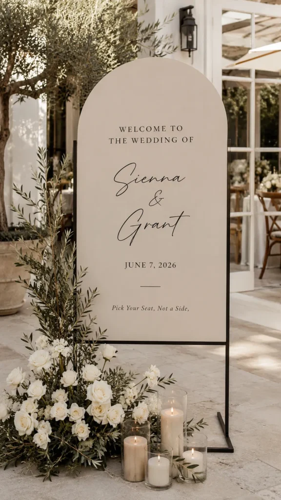
Budget Materials And Sign Stands That Behave
A pretty sign starts with the surface, but the stand matters too. I know. That sounds deeply unromantic. Yet nothing ruins the mood like a sign slowly tipping into a hydrangea.
Budget materials can look beautiful when you choose the right finish. Shiny can look nice, but glare can cause trouble. Matte finishes usually photograph better. They also hide small flaws, which feels kind and emotionally mature.
Good budget-friendly wedding sign materials include:
- Foam board for lightweight indoor signs
- Poster board inside a thrifted frame
- Printed cardstock behind glass
- Plywood for rustic or garden weddings
- Clear plastic sheets for an acrylic look
- Chalkboard signs for casual venues
- Canvas panels for soft, romantic displays
- Mirror signs for glam weddings
Now let’s talk stands, because stands have one job. Stand. Revolutionary, I know. But cheap stands can wobble, especially outside. Wind loves weddings. Wind also has zero respect for your timeline.
For sign stands, try these options:
- A wooden easel for classic displays
- A metal easel for heavier framed signs
- A tabletop stand for small welcome signs
- A floor frame with a weighted base
- A flower box base for hidden support
- A leaning sign against a wall or hedge
- A basket of flowers placed in front
- Zip ties hidden with greenery for outdoor setups
Here’s the reframe. The stand is part of the design. Do not treat it like an afterthought. A simple wood easel can make a low-cost wedding welcome sign look charming. A weak stand can make an expensive sign look nervous.
If the wedding happens outside, test the setup before the day. Not in your imagination. In real air.
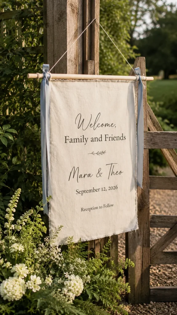
Where To Place The Sign Without Making Guests Wander
Placement can make a sign useful, or it can make it decorative clutter. I said what I said. A sign tucked behind flowers may look sweet in photos. But if guests cannot see it, it becomes a secret message. Weddings already have enough mystery.
Place the sign where guests naturally slow down. That might be near the venue entrance, walkway, ceremony path, garden gate, or reception door. Do not place it where people must stop in a narrow line. That creates a tiny traffic jam in dress clothes.
I tend to notice that signs work best when they face the guest’s path. A sign angled too sharply can look pretty from one side and useless from another. Think like a guest arriving late, holding a gift bag, and trying not to panic. That person needs clarity.
A wedding welcome sign should appear before guests need to choose a direction. It should not sit after the choice already happened. That feels like putting the map after the maze, which is rude behavior from a sign.
Also, watch the background. A white sign against a white wall can disappear. A clear sign against busy greenery can look messy. A mirror sign near bright sun can blind people with romantic sparkle. Pretty, but aggressive.
If the area looks plain, style the base. Add greenery, a lantern, ribbon, or two flower clusters. Keep it balanced, though. The sign should still lead the look.
The best placement feels natural. Guests arrive, see it, read it, and move forward. No hunting. No squinting. No “Are we at the right wedding?” whispers.
That little ease feels fancy, even when the sign cost less than dinner.

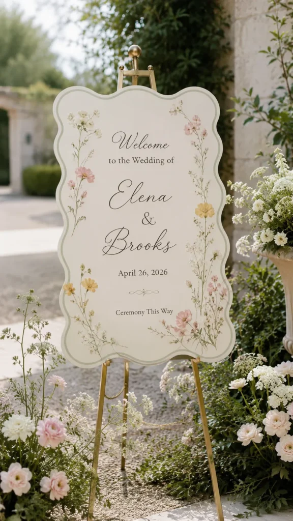
Wedding Welcome Sign Styles For Every Kind Of Party
A wedding welcome sign should match the party, not the Pinterest mood board that bullied you at midnight. This is where I want every bride to breathe. You do not need the “right” style. You need the style that fits your day.
For a garden wedding, soft florals and a painted frame can look lovely. Add sage, cream, blush, or dusty blue. Let the flowers do the flirting. The sign can stay simple and still look romantic.
For a beach wedding, use clean white, pale blue, sand, or driftwood tones. Avoid tiny script because bright light can make letters harder to read. A wood stand or woven basket at the base can add texture without screaming “theme party.”
For a modern wedding, black and white can do heavy lifting. Add one sharp font and one softer font. Then stop. Seriously, stop there. Modern signs look best when they have room to breathe.
For a rustic wedding, wood makes sense, but it can go too barn too fast. Pair wood with clean lettering, not overly swirly fonts. That keeps the wedding welcome sign from looking like a craft fair booth.
For a glam wedding, mirrors and gold frames work beautifully. However, keep the words bold enough to read. Glam should sparkle. It should not make guests tilt their heads like confused birds.
For a backyard wedding, framed prints are underrated. They feel warm, personal, and easy. Add ribbon or flowers, and suddenly it looks planned.
That is the secret. Style does not need to cost more. It needs to make sense. When the sign belongs in the space, guests believe the whole setup more.

FAQs Budget Brides Always Ask
Wedding signs look simple until you need to choose size, wording, height, material, and placement. Then suddenly, you’re measuring things like a tiny venue engineer. I respect the dedication. I also think we can make this easier.
Here are the questions I see most often:
- What size should a welcome sign be? An 18×24 inch sign works for many weddings. A 24×36 inch sign looks better for larger spaces.
- Does the sign need both names? Most couples include both names. You can also use last names, first names, or a shared phrase.
- Should I include the wedding date? Yes, if you want a keepsake. Skip it if you plan to reuse the frame or stand.
- Can I make my own sign? Yes, and it can look great. Use a clear template, strong contrast, and a clean print.
- What material looks best on a budget? Foam board in a frame often looks polished. Plywood also works well for rustic weddings.
- Do I need flowers around the sign? No, but flowers help connect the sign to the wedding. Greenery or ribbon also works.
- How do I stop an outdoor sign from falling? Use a sturdy stand, add weight, and test it outside. Wind acts innocent, then causes problems.
- Can one sign welcome guests and give directions? Yes, but keep the wording short. Too much text makes the sign hard to read.
Here’s the part that helps most. Choose function first, then style. A wedding welcome sign should welcome, guide, and look good. In that order. Pretty chaos still counts as chaos.
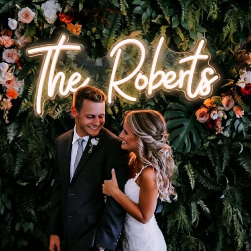
The Pretty Little Detail That Starts The Day
I love wedding details that do more than sit there looking cute. A wedding welcome sign does that. It greets guests, sets the tone, and quietly says, “Yes, this day has a plan.” That is a powerful little job for one board, frame, mirror, or piece of wood.
The best part is that it does not need to be expensive. It needs clear words, good contrast, and a spot where people can see it. Add one pretty thing, like flowers, ribbon, greenery, or a frame. Then let it breathe.
As someone in Orlando, I also think about heat, glare, wind, and outdoor entrances more than I probably should. But those practical details matter. A sign can look gorgeous on Pinterest and still fail in full sun. We are not doing that.
I’ve found that the sweetest wedding details usually feel calm, not crowded. They leave space for the couple, the guests, and the moment. That matters more than chasing every trend that pops up on your screen.
So, choose the sign that fits your day. Make it clear. Make it pretty. Make it sturdy enough to survive weather with opinions.
Then let it stand there like it belongs, because it does.