Choosing a wedding color palette sounds fun until every shade starts looking suspiciously similar. You save blush, mauve, champagne, burgundy, and sunset peach. Then Pinterest quietly hands you seventeen more versions of each. Suddenly, “soft pink” has become a full-time research project.
I love color, but I don’t love unnecessary wedding chaos. A good palette should make decisions easier, not create twelve new ones. It should help with flowers, dresses, paper, linens, candles, and every tiny detail nobody warned you about.
Living in Orlando makes me notice how quickly light changes color. A pale mauve can look gray indoors, then turn rosy outside. Burgundy can read rich and romantic at sunset, then almost purple under cool ballroom lights. That shift matters more than any perfect screen sample.
This post isn’t only about one look, either. We’re talking sunset wedding colors, Pantone champagne, dusty pink colour ideas, blush tones, pale mauve, and burgundy pairings. We’ll also get into moodboards, October schemes, and ways to keep everything budget-friendly.
Because yes, a wedding can look polished without custom-dyed napkins flown in from somewhere dramatic. Standard rentals, seasonal flowers, and smart repetition can do plenty. The secret usually isn’t adding more color. It’s knowing which shades should lead and which ones should quietly behave.
That part takes a little sorting. Once it clicks, though, the entire wedding starts looking more intentional.
And there’s one surprisingly simple test that exposes a confused palette almost immediately. We’ll get to it after the prettiest options.
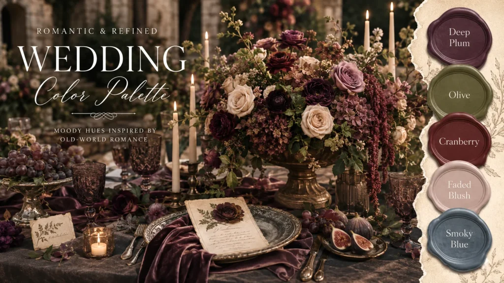
Wedding Color Palette Ideas That Set the Mood
The best wedding color palette starts with a mood, not a pile of swatches. That sounds obvious, yet color names can distract us quickly. “Champagne” seems elegant, while “dusty rose” sounds romantic. However, those labels don’t tell you how the full room should look.
I’d begin with three simple words. Maybe you want warm, relaxed, and romantic. Perhaps your choices lean moody, polished, and modern. Those words become a filter when a lovely shade tries to crash the party.
Here’s the reframe: your venue already owns part of the palette. Wood floors, patterned carpet, colored walls, and outdoor greenery all count. Ignoring them won’t make them disappear. They’ll simply appear in every photo anyway.
A ballroom with cool gray walls may suit mauve, plum, and silvered champagne. Garden venues may welcome blush tones, burgundy, and warm ivory. Meanwhile, a beach space can handle sunset peach without becoming aggressively tropical.
I tend to notice that three main shades work best. One shade should cover large areas. Another adds softness or personality. The third creates contrast and keeps everything from blending into beige fog.
Your wedding color palette can also include natural neutrals. Green leaves, wood tables, clear glass, and candlelight don’t need official names. They support the chosen colors without demanding more purchases.
Before ordering anything, place your three shades beside a venue photo. Then remove one color and look again. If the mood improves, that color was probably decorative clutter.
That little test can save money surprisingly fast. A clear palette reduces impulse buys, custom upgrades, and late-night panic orders. More importantly, it makes the wedding look like one story instead of several pretty ideas sharing a room.
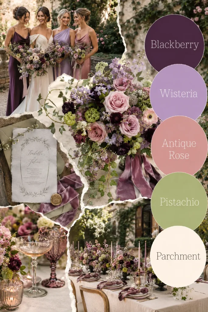
Sunset Wedding Color Palette Ideas With a Warm Glow
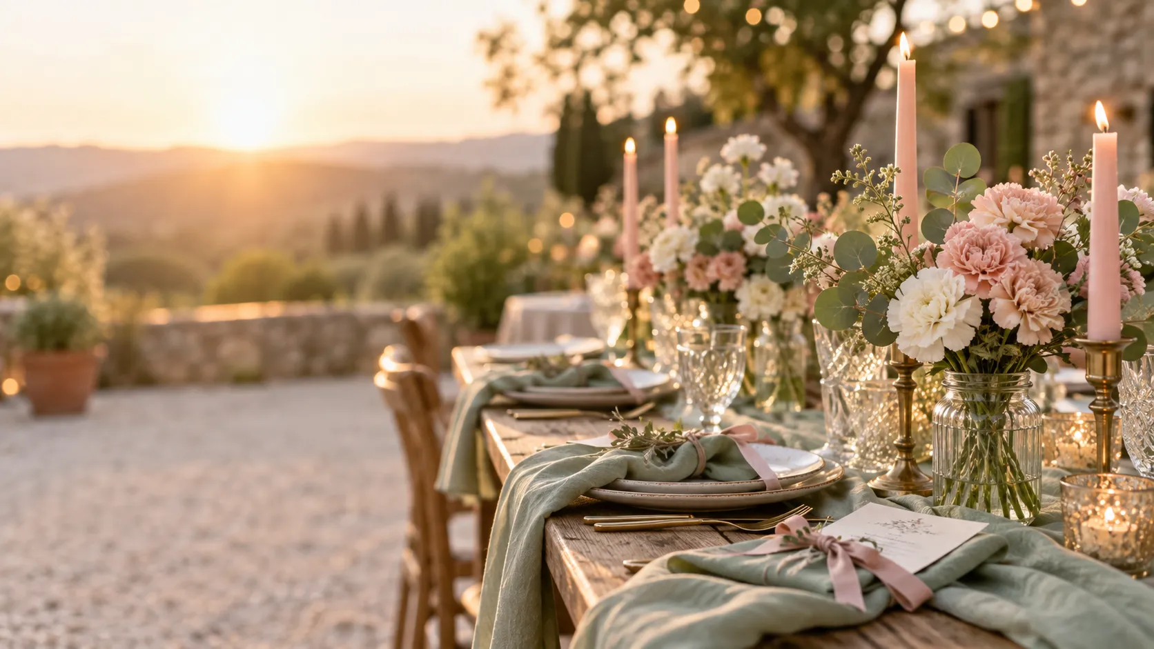
A sunset wedding color palette can look soft and romantic without covering everything in orange. The prettiest versions borrow the gradual color shift. They don’t copy a sunset like a paint-by-number project.
Start with a pale base, then move toward deeper accents. Champagne, blush, dusty rose, peach, and burgundy create that natural fade. Each shade gets a role, which prevents the reception from looking overly themed.
I’d divide the colors like this:
- Champagne: Use it for linens, paper, candles, and other large neutral areas.
- Blush tones: Add them through dresses, flowers, napkins, or soft fabric details.
- Muted peach: Keep it limited to ribbon, petals, menus, or small glowing accents.
- Burgundy: Place it near focal points, including bouquets, signs, and table flowers.
- Pale mauve: Use it when the palette needs a cooler bridge between pink and wine.
Here’s the surprising bit. Orange isn’t required. A sunset can inspire warmth, contrast, and movement without one obvious orange item. In fact, skipping bright orange often makes the whole look more refined.
Lighting deserves attention, too. Warm outdoor light softens burgundy and wakes up peach. Cool indoor light may flatten champagne or push mauve toward gray. Bring samples to the venue around your ceremony time.
For a budget-friendly wedding, this palette offers plenty of easy wins. Standard ivory linens can replace custom champagne ones. Grocery-store roses can bring blush tones. Burgundy ribbon can repeat the darkest shade for very little money.
The wedding color palette should look richer as the day gets darker. Candles and warm bulbs help those deeper shades emerge. That slow change gives the design its sunset mood, even when the ceremony happens nowhere near a beach.
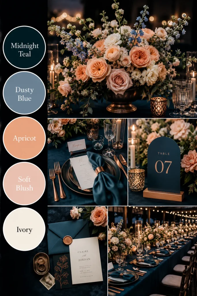
Pantone Champagne and Blush Tones That Look Polished
Pantone champagne sounds precise, but champagne shades can vary more than expected. Some lean beige, while others look cream, gold, pink, or gray. Fabric and lighting change them again, because weddings apparently needed another tiny mystery.
I treat Pantone champagne as a useful direction, not an unbreakable law. A physical sample matters more than a screen label. Phones brighten warm shades and can make two very different neutrals look nearly identical.
Blush tones bring the same problem. One blush looks peachy and cheerful. Another reads cool and barely pink. A third may turn lavender beside a yellow champagne. That doesn’t make either shade wrong, but the undertones must cooperate.
Warm champagne usually pairs well with peachy blush, dusty pink, burgundy, and antique gold. Cooler champagne works better with pale mauve, dusty rose, plum, and soft silver. The goal isn’t a perfect match. Instead, the shades should share the same general temperature.
Your wedding color palette will look more expensive when champagne covers the larger surfaces. Think linens, paper, backgrounds, and candles. Blush can then appear in smaller areas, while one darker color adds shape.
Without that deeper shade, champagne and blush may disappear into one creamy cloud. Burgundy, plum, or dark rose gives the eye somewhere to land. Even a few dark flowers can make every pale detail look more deliberate.
Here’s another money-saving truth: clear glass works beautifully with champagne. You don’t need colored goblets, custom chargers, and metallic flatware together. Choose one upgraded detail and let standard rentals handle the rest.
Bring champagne paper, blush fabric, and your darkest accent into the venue. If all three still look distinct, you have a strong combination. When they melt together, deepen one shade before buying anything else.
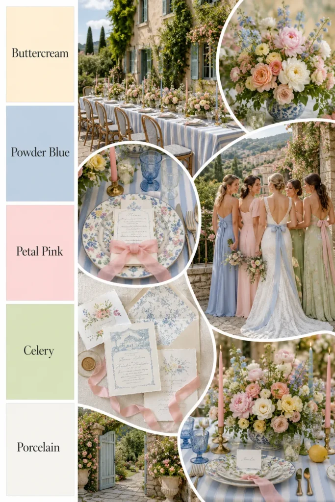
Dusty Pink Colour, Dusty Rose Pantone, and Pale Mauve
Dusty pink colour choices sit in the same family, but they don’t create the same mood. Usually, dusty pink looks warmer and lighter. By comparison, dusty rose feels deeper and more muted. Pale mauve often carries a cooler gray or purple undertone.
That difference matters when shopping across several stores. A product labeled “dusty rose” may arrive looking peach. Another may look nearly lavender. Color names are helpful, but they’re also little agents of chaos.
I’d sort the shades this way:
- Dusty pink: Choose it for a soft, warm, cheerful look.
- Dusty rose Pantone tones: Use them for a muted, romantic, slightly vintage mood.
- Pale mauve: Pick it when you want cooler elegance without using plain gray.
- Blush: Treat it as a flexible supporting shade, not a precise color promise.
These shades can live in one wedding color palette, but one should lead. Equal amounts may make the design look muddy. Let dusty rose cover the main fabric moments, then use pale mauve in smaller accents.
Bridesmaid dresses don’t need to match perfectly, either. Slight changes in shade can look rich and natural. Still, keep the undertones related so the group looks intentional rather than accidentally assembled.
Budget shoppers can use ribbon as the physical reference sample. Carry it when choosing dresses, flowers, paper, and napkins. One inexpensive spool can prevent several costly mismatches.
Also, compare every pink beside white. Bright white exposes gray, peach, and purple undertones quickly. Ivory does the same thing more gently.
Here’s the common assumption worth dropping: softer colors aren’t automatically safer. Pale shades can clash just as loudly as bold ones. Once their undertones agree, though, the whole palette becomes calm, layered, and wonderfully forgiving.

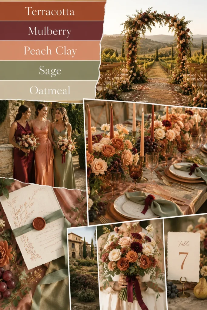
Burgundy Wedding Color Palette Matches That Add Depth
A burgundy color match can make pale shades look richer within seconds. It can also take over the room if used everywhere. Burgundy carries visual weight, so a little goes much farther than most couples expect.
First, check whether the shade leans red, purple, or brown. Red-based burgundy looks classic and warm. Purple-based burgundy feels moodier. Brown-based burgundy works beautifully with champagne, terracotta, and antique gold.
Dusty pink usually pairs best with warm, red-based burgundy. Pale mauve prefers a cooler wine or plum shade. Blush tones can work with either, depending on their undertone. This is where one physical sample earns its tiny place of honor.
A burgundy peony can inspire the floral direction, but it doesn’t require actual peonies. Seasonal flowers may offer the same color and shape for less. Dahlias, garden roses, mums, carnations, and ranunculus can create similar depth.
That substitution isn’t a downgrade. It’s a smarter use of the flower budget. Guests notice the overall color, texture, and fullness. They rarely conduct a stem-by-stem audit during cocktail hour.
I’d use burgundy near the moments people photograph most. Bouquets, ceremony flowers, place cards, cake details, and table centers all work well. Full burgundy linens may feel heavy and often cost more.
The wedding color palette needs contrast, but contrast doesn’t mean equal coverage. A dark ribbon repeated across flowers and paper may do enough. Small, steady echoes create more polish than one giant burgundy statement.
Test the shade under your venue lighting before committing. Cool light can push burgundy toward purple. Candlelight warms it and reveals more red.
The right burgundy should support the softer colors, not flatten them. When champagne looks brighter and dusty rose looks softer beside it, you’ve found the match.

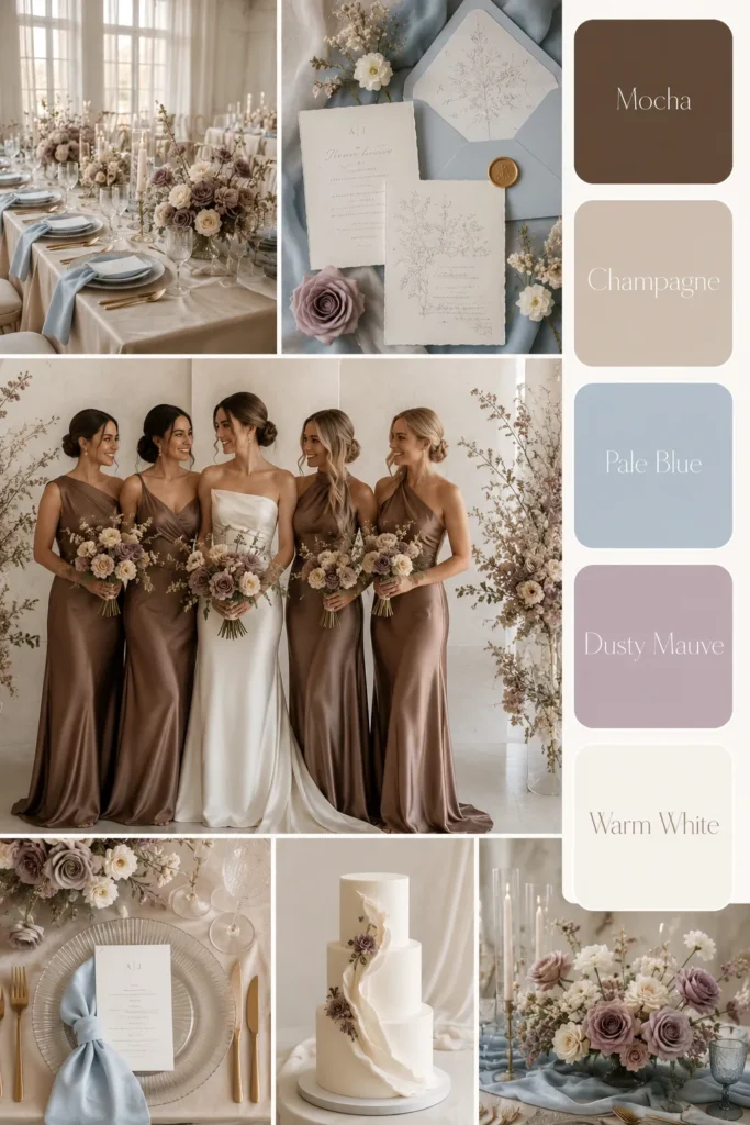
Moodboard Wedding Colour Palettes on a Realistic Budget
Moodboard wedding colour palettes work best when they guide choices instead of collecting pretty pictures. A board with eighty unrelated images won’t solve anything. It simply turns indecision into a highly attractive collage.
Start with one venue photo and one image that captures the mood. Then add colors, textures, flowers, clothing, and paper details. Every saved image should answer a question, not create another one.
A useful board might include:
- One main neutral: Champagne, ivory, warm beige, or soft gray.
- Romantic shade: Dusty pink, blush, dusty rose, or pale mauve.
- Deep accent: Burgundy, wine, plum, or muted berry.
- Glow color: Peach, copper, antique gold, or terracotta.
- Two textures: Velvet, satin, matte paper, glass, wood, or soft linen.
Now comes the mildly painful part. Remove anything that introduces a random new direction. The gorgeous blue candle photo may deserve admiration, but it doesn’t deserve voting rights.
Your wedding color palette should appear across several categories, not every object. Flowers can carry the deeper shades. Paper goods may stay neutral. Dresses can add softness, while candles provide warmth.
This approach also protects the budget. Instead of buying themed decorations, you repeat color through items already needed. Napkins, ribbons, flowers, menus, and dresses become the décor.
Take a screenshot of the finished board and keep it on your phone. Compare every purchase against it. “Close enough” can become expensive when five close-enough items all look different together.
The best moodboard feels a little restrained. That isn’t boring. It means the colors have stopped competing for attention. Once the board looks calm, shopping becomes faster, and the wedding starts looking far more connected.
Fall Wedding Color Palette Ideas for October Colour Schemes
Fall wedding color palette October colour schemes often lean orange, brown, and heavily rustic. That can look lovely, but it isn’t the only autumn option. October also suits champagne, dusty rose, pale mauve, burgundy, and muted peach.
The season already brings warm light, deeper shadows, and natural texture. Your colors don’t need to prove the wedding happened in fall. Pumpkins may attend, but they don’t need leadership positions.
I like champagne as the base because it softens darker autumn shades. Dusty rose adds warmth without becoming sugary. Pale mauve cools the mix slightly, while burgundy gives the whole palette depth.
Muted peach can appear in flowers, ribbon, or stationery. Keep it soft enough to blend with the pinks. Bright coral may pull the design toward summer, especially beside green foliage.
October flowers also create budget opportunities. Dahlias, mums, roses, carnations, and seasonal greenery can build a full look. A burgundy peony may inspire the color, while a dahlia delivers it more affordably.
Texture matters more during fall, too. Velvet ribbon, matte paper, warm wood, and taper candles add richness without adding new colors. That’s useful when the palette already contains several shades.
The wedding color palette should also consider the earlier sunset. More reception photos may happen under candles or artificial light. Antique gold and clear glass usually handle that change better than shiny yellow metal.
Here’s the less obvious choice: skip leaf-themed décor unless you truly love it. Autumn can come through color and texture alone. A champagne table with dusty rose flowers and burgundy ribbon already reads warm and seasonal.
October gets to influence the mood. It doesn’t get to decorate the entire wedding by itself.

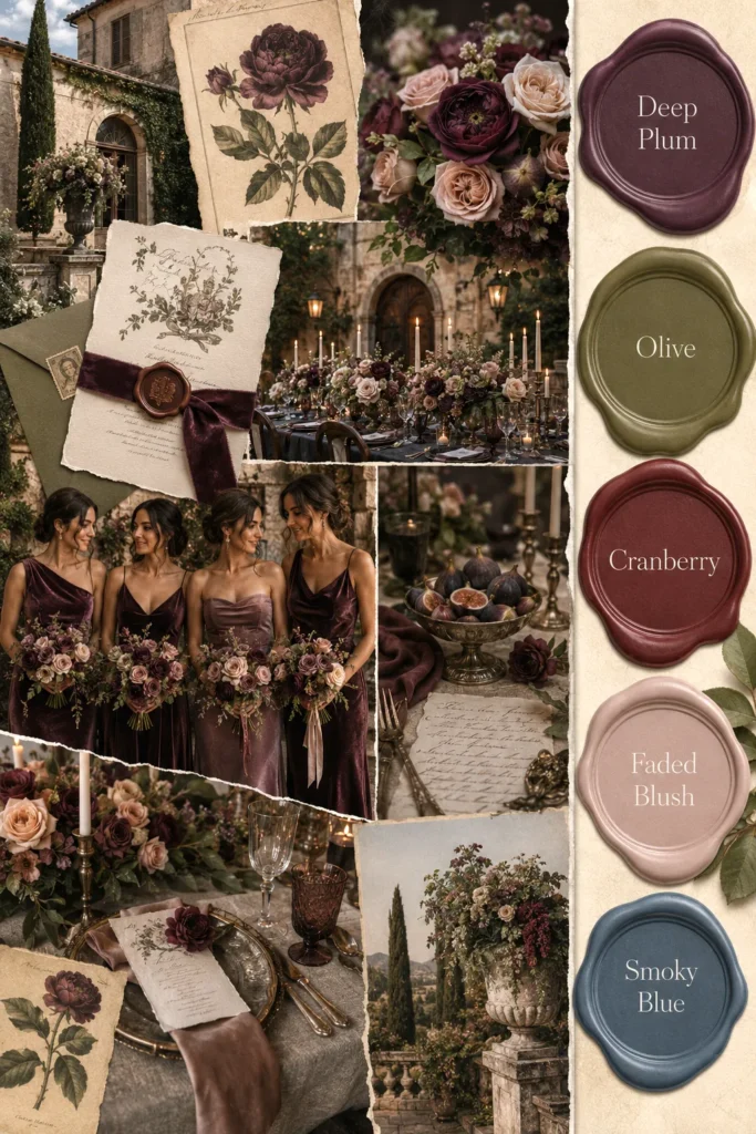
Color Palette FAQs Couples Always Ask
Color questions multiply once dresses, flowers, and rentals enter the picture. These common questions cause plenty of unnecessary second-guessing.
- How many colors should a wedding color palette include? Three main shades and one small accent usually work well. More colors need clear roles.
- Does every shade need to match perfectly? No. Related undertones matter more than exact matching. Slight variation often looks softer in photos.
- Can dusty pink and pale mauve work together? Yes, but one should lead. Use the other in smaller details.
- What colors match burgundy best? Champagne, blush, dusty rose, pale mauve, muted peach, and warm ivory pair beautifully with burgundy.
- Is Pantone champagne the same everywhere? Unfortunately, no. Fabric, paper, screens, and lighting change how champagne appears.
- Can a sunset palette work indoors? Absolutely. Use warm lighting, champagne neutrals, softened pinks, and burgundy accents.
- What makes a palette look expensive? Clear repetition, strong contrast, and fewer random details create polish. Custom products matter far less.
- Should flowers match the bridesmaid dresses? They should coordinate, not disappear into the dresses. Add lighter or darker flowers for contrast.
- How can I save money on wedding colors? Choose standard neutral rentals. Add color through flowers, ribbon, napkins, stationery, and clothing.
- When should the colors be finalized? Choose them before ordering dresses, paper goods, and major rentals. Keep flower shades flexible.
Here’s the larger answer beneath every question. A palette doesn’t need perfect control. It needs enough consistency that every choice looks related.
Materials and lighting will still create natural variation. That small amount of flexibility often makes the final design look better. Perfection usually looks flatter than thoughtful, controlled variation anyway.
When the Colors Finally Start Behaving
I think the best palette creates relief. It removes options, quiets the noise, and helps every remaining choice make sense. That matters when wedding planning turns one simple decision into fourteen open browser tabs.
A wedding color palette doesn’t need a clever name or exact formula. It needs a clear mood and a few dependable shades. Champagne can handle the background. Dusty rose or mauve can soften it. Burgundy can bring contrast without staging a takeover.
I’d keep one finished moodboard saved beside the shopping list. Pinterest will continue offering new ideas, because Pinterest has no respect for closure. Still, not every beautiful pin belongs inside your wedding.
Living in Orlando keeps reminding me that light changes everything. Warm evening sun can soften burgundy and brighten champagne within minutes. Indoor lighting may do the opposite. That movement isn’t a problem. It’s part of what makes the colors look alive.
So, test the important materials together, then stop chasing perfect matches. Choose seasonal flowers when they support the mood. Use standard rentals where nobody will notice. Spend on the pieces that appear in the most photos.
Most importantly, let the palette support the celebration. It shouldn’t become another guest who requires constant attention. The colors can be romantic, dramatic, soft, or rich without controlling every napkin and candle.
Once the shades work together, the wedding begins to look settled. It won’t look overdesigned. Nothing will look underdone. Just clear, warm, and unmistakably yours.
And that’s when the dusty rose swatches may finally leave the kitchen counter.